Why Apple's "Liquid Glass" in iOS 26 Is Creating Real Usability Problems.. Practical Lessons for UI/UX Designers
Imagine you're sitting in your office in Riyadh or Dubai, working on a fresh mobile app interface, and suddenly the entire design world starts talking about Apple's new "Liquid Glass" look in iOS 26 As someone who has been designing apps and websites in the region for years, I've experimented with similar translucent and dynamic effects before and honestly, this update feels like a beautiful concept that went too far. Liquid Glass turns buttons, navigation bars, icons, widgets, and even system controls into shimmering, fluid, glass like surfaces that reflect light, refract colors, and constantly morph While it looks incredibly modern on first glance, many real users and experienced designers are noticing serious usability trade-offs.
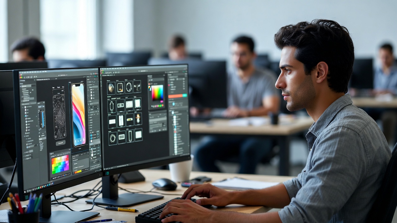
According to detailed analysis from Nielsen Norman Group, the biggest issues come from reduced readability, excessive motion, unpredictable navigation, and smaller touch targets If you're currently thinking "I need to hire a designer to build my app" or you're looking for reliable mobile app design services, this is exactly the kind of trend we need to understand deeply before jumping in.
What Is Liquid Glass and Where Did It Come From
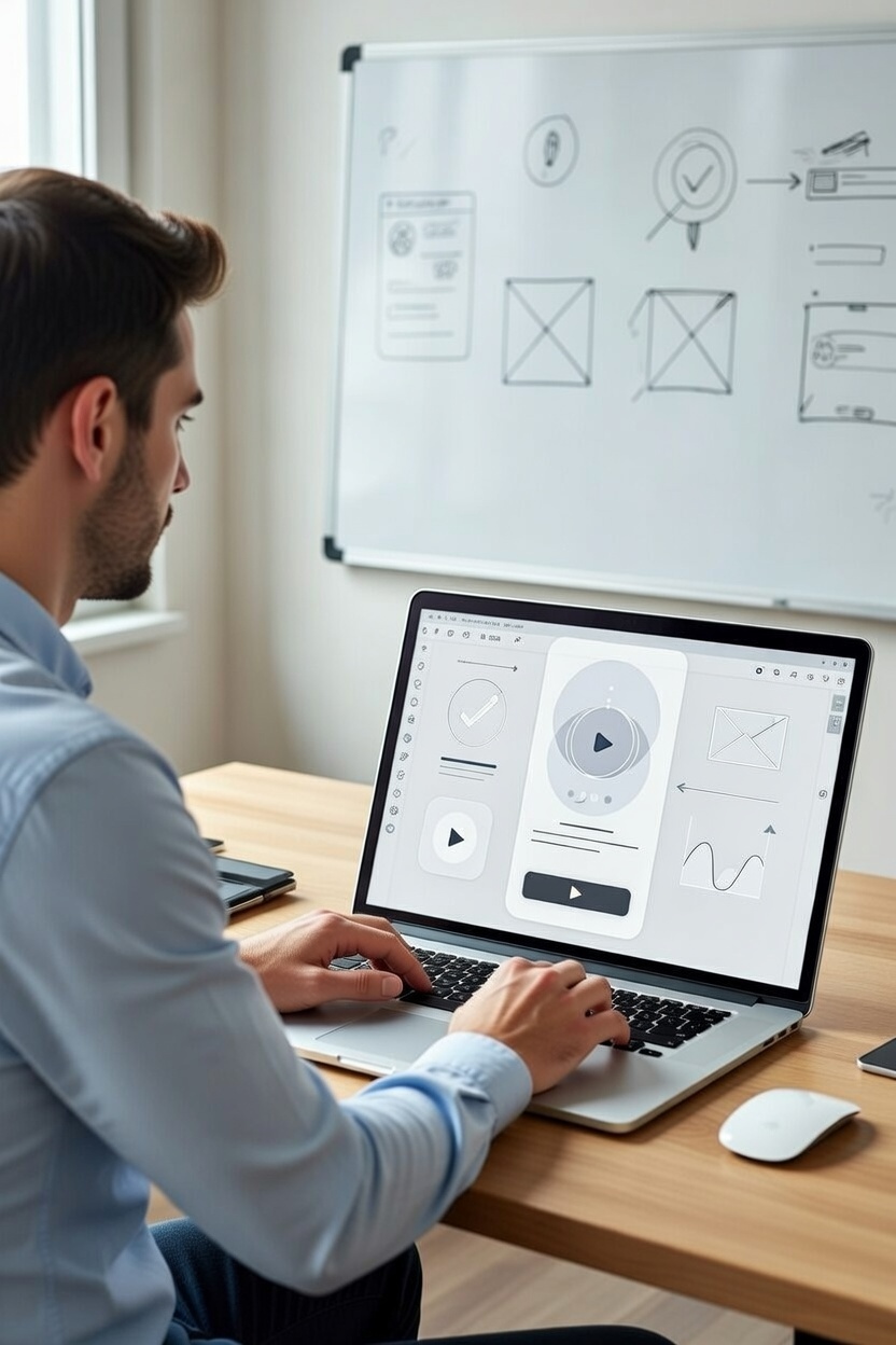
Liquid Glass is Apple's evolution of glass morphism that semi transparent, frosted-glass aesthetic that's been popular for years In iOS 26, Apple took it to the extreme: almost every interface element becomes dynamic and translucent, with reflections, refractions, and subtle bubbling animations The idea is to make the UI feel alive, draw attention to important content, and create depth.
I tried something similar a couple of years ago when I was working as a freelance web designer on a health & fitness app redesign for a client in the UAE. We added heavy transparency layers thinking it would look premium and contemporary The result? Users kept complaining that text disappeared against busy background images The same problem is happening now at scale in iOS 26 in Messages, conversation text blends into wallpaper photos, in Mail the content becomes almost unreadable when layers overlap, and in Maps icons fade into noisy backgrounds.
The Main Usability Problems Caused by Liquid Glass
The number one complaint is poor readability Transparency dramatically reduces contrast. Text over blurred or colorful backgrounds becomes extremely hard to read Floating controls compete with the actual content instead of supporting it.
Second is excessive and unnecessary motion Buttons shimmer without reason, tab bars bubble and ripple, song titles in Music bounce like a liquid ticker tape In Safari and other apps, controls appear and disappear unpredictably Many users report motion discomfort or even mild nausea something I've personally heard from testers in previous projects when we overused animated effects.
Touch Targets and Navigation Confusion
Liquid Glass also makes touch targets smaller and more crowded Tab bars are tighter than in previous iOS versions, spacing is reduced, and important controls get squeezed This directly violates basic accessibility and usability guidelines (minimum recommended tap target size is usually 44×44 points).
Navigation has become less predictable too In the Health app, the tab bar collapses during search In Safari, the forward button hides or moves. Back buttons sometimes disappear completely Users have to relearn muscle memory the opposite of what good design should do.
Practical Lessons for Designers in the Middle East & Beyond
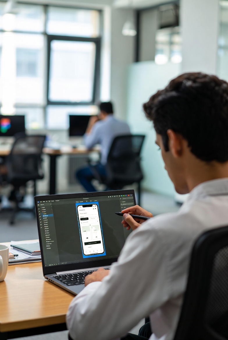
If you're a freelance UI UX designer, Figma UI UX designer, or considered one of the best UI UX designers for mobile apps working with clients in Egypt, Saudi Arabia, or the UAE here are the real takeaways from Apple's Liquid Glass experiment:
1. Clarity always wins over visual spectacle
Use transparency very sparingly and only when it genuinely improves focus. Never sacrifice contrast and legibility for aesthetics.
2. Motion should serve a purpose
Animations are great for feedback and guiding attention but random shimmering and bubbling usually just distracts.
3. Respect touch target sizes and spacing
Crowded interfaces lead to mis taps and frustration. Always give controls breathing room.
4. Keep navigation predictable
Users should never have to wonder where the back button went or why the tab bar suddenly disappeared.
When startups or businesses come to me saying "design my app UI UX" or looking for an app redesign service, I always show them real user testing data instead of just pretty mockups Liquid Glass proves even Apple can sometimes prioritize visual wow over practical usability don't make the same mistake.
The most successful apps are the ones people use effortlessly every day, not the ones that look amazing for three seconds and then frustrate users. Focus on clean, clear, predictable experiences and your mobile app prototype design (or full product) will actually get used and loved.